



Walk into any appraisal office and you'll find analysts pulling comps from MLS grids, sorting by distance, checking boxes for similar features. Standard workflow. Gets reports done. But three weeks later, a reviewer comes back questioning why you picked a comp 1.2 miles away when there's a cluster of similar sales 0.8 miles in the opposite direction. Or worse, they ask about market boundaries you never actually mapped.
The problem isn't bad comp selection. It's that traditional distance-based searches miss geographic reality. Rivers, highways, school district lines, neighborhood transitions—these shape markets more than simple radius measurements. Yet most appraisers still rely on basic MLS radius searches and a quick Google Maps check.
Geospatial comparables appraisal changes the entire approach. Instead of just measuring distance, you're analyzing actual market geography—travel time, natural boundaries, sale clusters, demographic transitions. And the tools to do this professionally cost less than your monthly MLS subscription.
Why radius searches fail in real markets
Pull up any suburban market and draw a half-mile circle around a subject property. That circle probably crosses a major highway, includes homes from different school districts, maybe even captures parts of different municipalities. A comp 0.4 miles north might require crossing train tracks and entering a completely different market area. Meanwhile, a property 0.7 miles south sits in the same subdivision, same school zone, similar lot sizes.
Traditional radius searching assumes markets form perfect circles. Real markets follow roads, respect boundaries, cluster around amenities. A geospatial comparables appraisal approach maps these patterns instead of ignoring them.
The operational impact compounds fast. Every time a reviewer questions comp selection, you're looking at 20-30 minutes explaining your choices, possibly revising the report. Multiply that across dozens of reports monthly. Some appraisers overcorrect by sticking to ultra-conservative comp selection, missing genuinely comparable sales that would actually support their value conclusions.
Buffer zones vs travel-time polygons: practical differences
Most appraisers know buffer zones—circles or fixed-distance boundaries around properties. Simple to create, easy to explain. Draw a half-mile buffer, grab everything inside. But buffers treat geography like blank paper. They assume equal access in all directions.
Manage every appraisal with confidence and clarity.
Rateoly helps you coordinate inspections, generate reports, and communicate seamlessly with clients.
- Comprehensive appraisal tracking
- Automated client notifications
- Integrated scheduling & report management
No credit card required
Travel-time polygons work differently. Instead of measuring straight-line distance, they follow actual roads and calculate real drive times. A 5-minute drive polygon might extend 1.5 miles along a major road but only 0.3 miles through a residential maze. The shape reflects how people actually move through the area.
Half-mile buffer approach:
-
Captured 47 sales
-
Included 3 different school zones
-
Crossed major highway barrier
-
Mixed $200k-$450k price ranges
-
Required extensive filtering
5-minute drive polygon:
-
Captured 31 sales
-
Single school zone
-
Respected highway boundary
-
Tighter $275k-$350k range
-
Natural market area
| Half-mile buffer approach | 5-minute drive polygon |
|---|---|
| Captured 47 sales | Captured 31 sales |
| Included 3 different school zones | Single school zone |
| Crossed major highway barrier | Respected highway boundary |
| Mixed $200k-$450k price ranges | Tighter $275k-$350k range |
| Required extensive filtering | Natural market area |
The travel polygon immediately highlighted the actual competitive market. No manual filtering needed. The exhibit practically wrote itself—reviewers could see why certain comps made sense while others didn't.
Setting up travel polygons sounds complex but takes about three clicks in most mapping tools. QGIS (free, open source) has plugins that connect to routing services. Even Google Maps lets you explore drive-time areas, though you can't export them directly. The technical barrier disappeared years ago—it's mostly habit keeping appraisers stuck with basic radius searches.
Cluster detection patterns that reveal true market segments
Sometimes the best comps aren't the closest ones. They're part of a market cluster that shares characteristics with your subject, even if other properties sit between them. Manual inspection might spot obvious clusters, but systematic detection finds patterns humans miss.
Take a typical suburban appraisal scenario. Subject property sits in a 1970s subdivision. Half-mile radius includes everything from 1950s ranches to 2010s McMansions. Run basic cluster analysis on recent sales and distinct groups emerge:
-
Original 1970s homes, mostly 3-bed ranches, selling $280k-$320k
-
Expanded/renovated versions, 4-bed with additions, $340k-$390k
-
Teardown/rebuilds, new construction, $450k+
-
Adjacent 1960s neighborhood, similar sizes but different school district, $250k-$290k
Standard MLS searching treats these as one market. Cluster detection separates them automatically. The subject clearly belongs to group one or two depending on condition. Groups three and four aren't comparable despite being closer geographically.
The actual process isn't complicated. Export your sales data with addresses, run them through a geocoding service (plenty of free options exist), import into QGIS or even Google Earth. Use built-in clustering tools—DBSCAN works well for sale locations, K-means for price and size combinations. Takes maybe 15 minutes once you know the workflow.
What emerges are natural market boundaries that follow value patterns, not arbitrary distances. Present this as a map exhibit showing clustered sales with your selections highlighted. Reviewers see market logic, not just proximity.
Building professional map exhibits with free tools
Professional-looking map exhibits used to require expensive GIS software or outsourcing to graphic designers. Now you can produce publication-quality maps with completely free tools. The difference between amateur and professional exhibits comes down to workflow, not software costs.
Start with QGIS—free, runs on everything, handles all standard mapping tasks. For base maps, grab high-resolution aerials from your state's GIS portal or use Google Earth imagery. Most counties provide parcel boundaries as downloadable shapefiles. The setup takes one afternoon of YouTube tutorials.
A basic exhibit workflow that produces consistent results:
-
Base layer setup County aerials or street map, muted colors so data stands out
-
Parcel boundaries Just subject and comps, different colors for each
-
Sale markers Graduated symbols—bigger = more recent, color = price range
-
Context layers School boundaries, major roads, neighborhood names
-
Analysis overlay Your buffer/polygon, cluster boundaries, or market areas
-
Clean labeling Property addresses, sale prices, key features
-
North arrow and scale Professional necessity, takes 10 seconds
The styling is where it comes together. Use ColorBrewer for color schemes that print well and look professional. Keep fonts consistent—Arial or Helvetica, nothing fancy. Export at 300 DPI for reports.
Use ColorBrewer palettes for print-friendly, high-contrast color schemes that maintain legibility in black-and-white prints.
A solid map exhibit shows three things clearly: subject location, comp locations, and why you chose those specific comps. Whether that's through drive-time polygons, cluster boundaries, or geographic features, the visual makes your logic obvious.
Common QGIS workflow for appraisers
Opening QGIS for the first time feels overwhelming—hundreds of buttons, unclear menus, documentation written for GIS professionals. But appraisers only need about 5% of the features. Here's the stripped-down workflow that handles most appraisal mapping needs.
Initial setup (one time only): Install QGIS, add the QuickMapServices plugin for base maps, download your county's parcel shapefile. Create a template project with your preferred layout. Total time: around 45 minutes.
Per-report workflow: Open template project. Add comp addresses using the geocoding plugin or paste coordinates from MLS. Most MLS systems now include lat/long in exports—huge timesaver. Drop points on map, style by sale date or price.
Creating buffers: Select subject parcel, Vector menu > Geoprocessing > Buffer. Enter distance, choose miles or feet. Creates perfect circles or squares instantly. For drive-time polygons: Install the ORS Tools plugin (free), enter your subject address, select travel mode and time. Generates realistic market boundaries in seconds.
Adding context: Layer menu > Add Layer > Vector Layer for shapefiles (parcels, school zones). Add WMS Layer for aerial imagery. Most states host these services free—just need the URL.
Quick cluster detection: Select your sale points, Vector menu > Analysis Tools > K-means clustering. Start with 3-4 clusters, adjust based on results. Colors code automatically.
Export: Project menu > New Print Layout. Drag map to page, add legend, scale, north arrow. Export as PDF or high-res image. Embed directly in appraisal report.
The entire process takes 10-15 minutes once you're comfortable. Compare that to explaining comp selection in narrative form or defending choices during review.
Here's a quick visual of the core workflow.
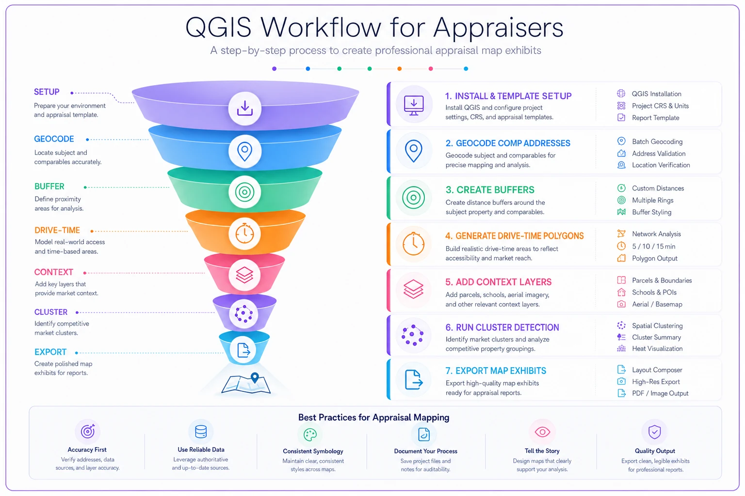
This flow shows the main steps from initial setup through export so you can reproduce the process quickly.
Integrating travel-time analysis into standard reports
Adding geospatial comparables appraisal methods doesn't mean rewriting your entire report template. It means enhancing specific sections where visual analysis adds real value. Most appraisers find three integration points work best.
First, the neighborhood section. Instead of describing boundaries in text, include a neighborhood map showing the subject's position within the market area. Add your travel-time polygon or relevant geographic features. One image replaces paragraphs of description and immediately orients reviewers.
Second, comp selection discussion. Include a map showing all recent sales with your selections highlighted. Overlay your selection criteria—whether that's drive-time boundaries, cluster membership, or geographic constraints. Reviewers see your methodology immediately.
Third, adjustment support. When you're adjusting for location, show it visually. Map the quality differences between areas, highlight school boundaries, show distance to amenities. Visual evidence supports your adjustments better than narrative explanation alone.
The key is consistency. Develop standard map templates you can reuse—same color schemes, same layout, same legend structure. This speeds production and looks professional. After a few reports, creating these exhibits becomes automatic routine.
Keep file sizes reasonable. Export maps at 150-300 DPI, compress PDFs properly. Most exhibits work fine at half-page size—readable without overwhelming the report.
Defensible geographic boundaries without overthinking
Every appraiser has faced this: "Why did you search 0.5 miles instead of 0.75?" Or "Why exclude sales across Main Street?" Without visual evidence, these become subjective debates. With proper mapping, boundaries justify themselves.
Natural boundaries matter more than arbitrary distances. Rivers, highways, railroad tracks—these create real market divisions. School district lines directly impact values in family-oriented neighborhoods. Zoning boundaries separate commercial from residential. Map these explicitly and comp selection becomes logical, not arbitrary.
The approach that works: start broad, then constrain based on observable patterns. Pull everything within a mile, map it all, look for natural breaks. Where do prices shift? Where does property type change? Where do buyers typically search?
Document your boundary logic in both visual and written form. Include a boundary map showing major features and divisions. Write a brief explanation: "Market area bounded by Highway 50 (north), Creek Road (south), within Madison School District. This encompasses the subject's immediate competition while respecting natural and administrative boundaries that affect buyer behavior."
Some reviewers want statistical support for boundaries. Run basic stats on properties inside versus outside your boundaries. Show median price differences, days on market variance, buyer profile changes. But don't overthink it. Clear geographic logic beats complex statistical justification most of the time.
One pattern worth avoiding: creating unique boundaries for every single report. Develop standard market areas for neighborhoods you appraise regularly. Consistent boundaries across reports build credibility. Adjust only when a specific property genuinely warrants it.
Open-source alternatives to expensive GIS software
The GIS industry wants you to think professional mapping requires thousand-dollar licenses. ArcGIS runs $3,000+ annually for basic desktop access. But open-source alternatives now match or exceed commercial features for appraisal work.
QGIS: Completely free, updated regularly, massive plugin ecosystem. Handles everything from basic mapping to complex spatial analysis. Learning curve exists but YouTube solves that. Most appraisers master the basics in a weekend.
Google Earth Pro: Now free, excellent for quick visualizations. Limited analysis features but perfect for simple exhibits. The historical imagery feature helps track neighborhood changes over time. Export directly to image files for reports.
OpenStreetMap + uMap: Web-based, no installation needed. Create custom maps with your data, share via links. Great for collaboration or when working across multiple computers. Limited styling options but dead simple to use.
R with mapping packages: For the data-oriented appraiser. Steep learning curve but incredibly powerful for statistical analysis combined with mapping. Automate entire workflows—pull MLS data, geocode, analyze, map, export. Probably overkill unless you're doing high volume.
PostgreSQL + PostGIS: Database solution for firms with multiple appraisers. Centralize geographic data, run queries across reports, maintain consistent market areas. Requires setup time but transforms how larger offices handle geographic analysis.
Switching to open-source isn't just about saving money. These tools update faster, have better documentation, and large communities providing support. When you hit a problem, someone's already solved it and posted the solution online.
Actual time investment vs review pushback reduction
Real numbers: setting up geospatial comparables appraisal capability takes roughly 6-8 hours initially. Learning QGIS basics, finding data sources, creating templates. Then 15-20 minutes per report for actual mapping work. Sounds like added burden until you calculate the alternative.
Every comp selection question from a reviewer triggers a chain reaction. Read the question (5 minutes), research your response (15 minutes), write the explanation (10 minutes), possibly revise the report (20 minutes). One pushback equals 30-50 minutes. And that assumes simple resolution—complex challenges take much longer.
A mid-sized appraisal shop handling 200 reports monthly might face comp questions on 15-20% of them. That's 30-40 instances monthly, consuming 20-30 hours of senior appraiser time. Time spent defending past decisions instead of producing revenue.
Then factor in the soft costs. Reviewer relationships deteriorate with repeated pushback. Report acceptance slows. Lenders start requesting other appraisers for complex assignments. None of that shows up on a time log but it compounds.
Those 15-20 minutes of upfront mapping eliminate most reviewer questions before they arise. The exhibits demonstrate professional methodology. Reviewers appreciate the clarity and move on. The time investment pays back within the first month, and the improved workflow compounds with other operational improvements throughout the practice.
Building reusable neighborhood templates
Every appraiser has their regular areas—neighborhoods they appraise monthly, markets they know well. Yet most rebuild geographic analysis from scratch each time. Creating reusable templates changes that.
Start with your bread-and-butter neighborhoods. Map them properly once—boundaries, landmarks, school zones, typical sale patterns. Save as QGIS project files or Google Earth KMZ files. Next time you work that area, load the template, add new sales, export. Five minutes instead of twenty.
Template structure that works:
-
Base neighborhood boundary polygon
-
Standard search areas (0.25, 0.5, 1 mile buffers)
-
School district boundaries
-
Major roads and landmarks labeled
-
Typical sale clusters marked
-
Demographic or value gradients if relevant
Update templates quarterly with new sales, boundary changes, market shifts. Some appraisers maintain templates for 20-30 regular neighborhoods, covering most of their assignments.
The template approach also standardizes methodology. Reviewers see consistency across reports from the same neighborhood. Your geographic analysis becomes predictable and defensible. It shows systematic thinking rather than ad-hoc decisions.
Share templates within your office. If multiple appraisers work the same areas, standardized templates ensure consistent analysis—particularly important for larger firms where different appraisers might handle reviews or updates.
Adjustments backed by geographic patterns
Location adjustments often feel arbitrary. "5% for inferior location" based on... what exactly? Geographic analysis provides concrete support for adjustments that previously relied on appraiser judgment alone.
Map your comparable sales with values labeled. Patterns emerge quickly. Properties along the busy road sell for $10-15k less. Homes in the original section trade at a discount to the newer phase. Corner lots command premiums in some areas, not others. These patterns justify specific adjustments.
One approach worth developing: heat maps of sale prices per square foot. QGIS generates these automatically—just need sale data with prices and coordinates. The visual gradient shows exactly where values shift and by how much. Screenshot it, include it in your workfile. Adjustment supported.
School boundary analysis provides another adjustment tool. Map recent sales colored by elementary school. Calculate median price per square foot for each school zone. The difference becomes your baseline for school-related location adjustments. Update quarterly as new sales occur.
Distance to amenities matters but measuring it manually wastes time. Use QGIS network analysis to calculate actual travel time from comps to relevant amenities—commercial centers, employment, recreation. Sort comps by these distances and patterns in the data suggest appropriate adjustments.
The goal isn't perfection—it's defensibility. When reviewers question your 3% location adjustment, you show the map exhibit demonstrating comps from that specific area consistently selling below others. Visual evidence beats lengthy narrative explanation every time.
Scale this approach across your firm
Individual appraisers adopting geospatial comparables appraisal see immediate benefits. But firm-wide implementation multiplies the impact. Standardized geographic analysis becomes a competitive differentiator.
Start with a pilot program. Choose your most tech-comfortable appraiser, have them develop initial templates and workflows. Document what works and what doesn't. Build internal expertise before rolling out broadly—this prevents firm-wide frustration with new tools.
Invest in basic training. A half-day workshop covering QGIS basics, template use, and exhibit creation. Most appraisers grasp the essentials quickly when shown practical applications. Follow up with weekly check-ins where appraisers share interesting geographic patterns they've discovered.
Create a central repository for geographic resources. Shapefiles for standard areas, template projects, style guides for consistent exhibits. Store on shared drives or cloud storage. This prevents everyone from recreating the same base materials.
Standardize output formats. Develop firm exhibit templates—consistent colors, fonts, layouts. Reviewers learn to recognize and trust your firm's geographic analysis style, which matters more than it might seem.
Consider appointing a geographic point person who maintains templates, sources new data, and troubleshoots technical issues. This person doesn't do all the mapping but keeps operations smooth for everyone. Usually a younger staff member who's genuinely interested in the technical side fills this role well.
For larger firms, AI-powered operational software increasingly handles the technical heavy lifting—automated geocoding, instant buffer generation, integrated cluster analysis. The appraiser focuses on interpretation while the platform manages the mechanics. These tools bridge the gap for less technical staff while maintaining geographic rigor.
Track metrics throughout the rollout. Count reviewer questions before and after geographic analysis adoption. Measure time spent on comp selection and defense. Use data to refine the process and make the ROI visible.
The transformation doesn't happen overnight. Expect 3-4 months before geographic analysis becomes routine. But once embedded, firms rarely revert to pure distance-based searching. The visual clarity and defensibility prove too valuable.
Beyond basic exhibits: advanced patterns worth exploring
Once comfortable with basic mapping, several advanced techniques provide deeper market insights. Not necessary for every report, but valuable for complex assignments or market studies.
Temporal analysis shows market evolution. Map sales by year, animate the progression. Watch neighborhoods change, see where development pressure builds, identify declining areas. This context enriches neighborhood descriptions and supports time adjustments.
Multi-criteria overlays combine different geographic factors—school quality scores, crime statistics, walkability ratings, flood zones. Layer these onto sale data to understand value influences. Particularly useful in urban areas where multiple factors compete.
Accessibility scoring moves beyond simple distance. Calculate cumulative access to employment, shopping, schools, and recreation. Properties with high combined access often command premiums not explained by individual distances.
View corridor analysis matters in scenic areas. Which properties can actually see water, mountains, or city lights? GIS tools calculate viewsheds from any point. Map these against sales to quantify view premiums. Much more defensible than "partial view" or "full view" descriptions.
These techniques distinguish expert appraisers from average practitioners. Not every client needs this level of analysis—but when they do, you're ready.
Making geographic analysis stick
The biggest failure in adopting geospatial comparables appraisal isn't technical—it's abandoning the practice after initial enthusiasm fades. Making it stick requires embedding geographic thinking into standard workflows, not treating it as optional.
Build mapping checkpoints into your report process. Before selecting comps, create a quick map. Before writing the neighborhood section, review boundaries visually. Before finalizing adjustments, check geographic patterns. These become natural pause points rather than additional steps.
Maintain momentum through small wins. Start with simple buffer maps. Add travel polygons once comfortable. Introduce cluster analysis when appropriate. Each incremental improvement builds confidence without overwhelming anyone.
Connect geographic analysis to business outcomes. Track how map exhibits reduce revision requests. Document time saved on comp defense. Make the return on investment visible and concrete.
Address resistance directly. Some appraisers fear technology, others resist change generally. Pair resistant appraisers with enthusiastic adopters. Show how geographic tools solve their specific pain points. Celebrate when skeptics become converts—it happens more than you'd expect.
This isn't really about technology or maps or software. It's about seeing markets as they actually exist—shaped by geography, boundaries, and spatial relationships. Once appraisers start thinking geographically, they rarely go back. The maps just make that thinking visible to everyone else.
Ready to elevate your appraisal operations?
Join 500+ appraisal firms using Rateoly to enhance accuracy, save time, and improve client satisfaction.